- WorkWork
- AboutAbout
- Contact UsContact Us
- The HubThe Hub
- SearchSearch
A refreshed brand identity — the perfect finish for this industry-defining product.
Cerakote is hands down the best ceramic thin film coating on the market today. Our goal—make sure that the brand communicated the best in class nature of the product and positioned it for growth.
First, we established a visual and emotional tone for the new branding. We took inspiration from the US military’s special forces—we felt that the refreshed Cerakote brand should feel like a rugged yet sophisticated Navy Seal.
Cerakote has always been synonymous with firearms—however partnerships with Nixon and Oakley have created opportunities for the brand to move into other categories. We crafted a wordmark that would retain recognition with current customers while positioning the brand for growth in new markets.
FIREARMS
AUTOMOTIVE
MOTORSPORT
SPECIALTY
MILITARY
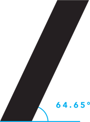
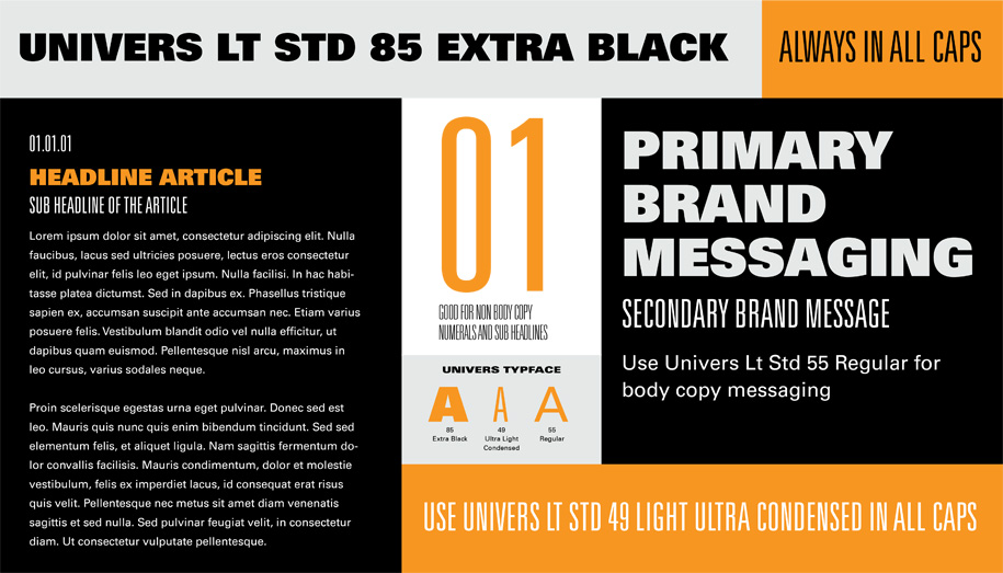
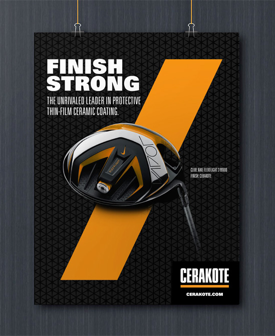
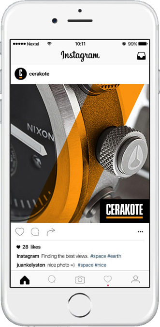
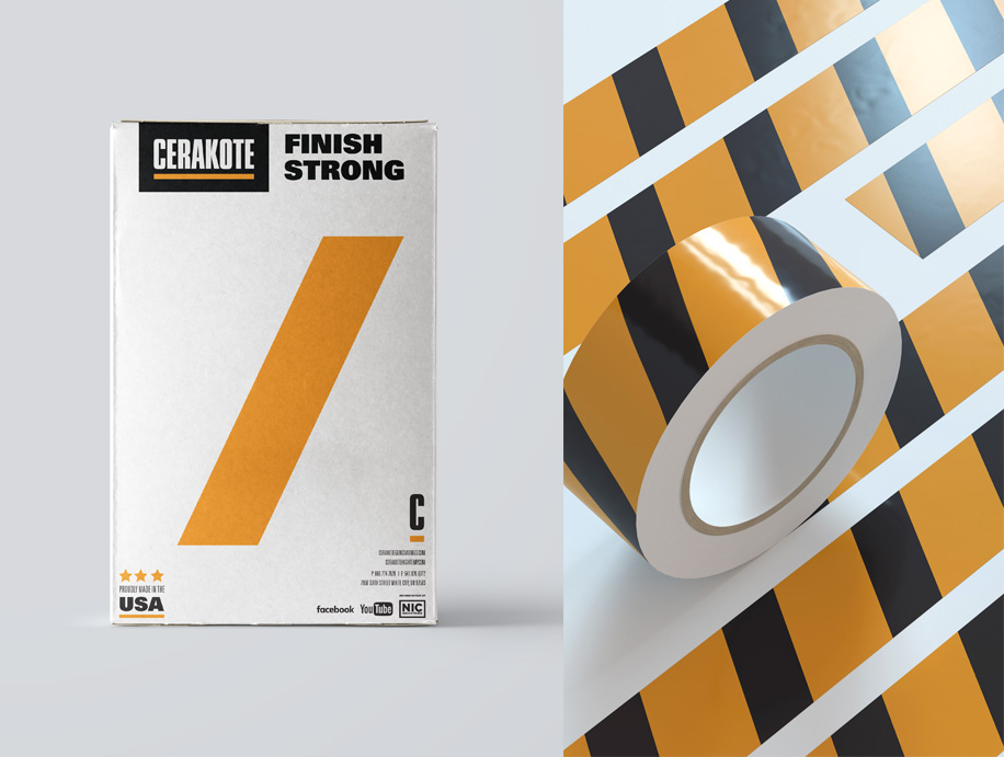
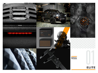
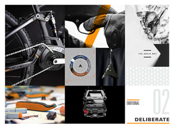
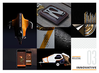
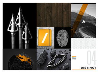
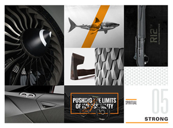
We developed a new graphic language to extend the identity: typography rules, custom iconography, armor-inspired textures, and the “finishing graphic”—a slash set at precisely 64.65 degrees (a critical number in the product’s engineering process).
We turned a throwaway box into a significant touchpoint for the brand without an increase in production costs.
We’re comfortable in our skin. We have no need to exaggerate with over the top claims or posturing. We won’t shy away from stating facts or asserting claims of superiority—however, there is a fine line between confidence and insecure bragging.
We created rules to govern how Cerakote should sound in written communications. This helps to ensure that the way the brand looks and the way it sounds remain in sync. One of the principles of the new voice is listed above.